


Responsive by default
Time to read
, 1534 words, 3rd grade
Many developers believe that it is tricky to ensure responsiveness in web design. And that achieving a design that works on any screen resolution or aspect ratio is difficult.
Too many developers are not willing to make that effort. The consequence? Poorly-coded websites everywhere you look.
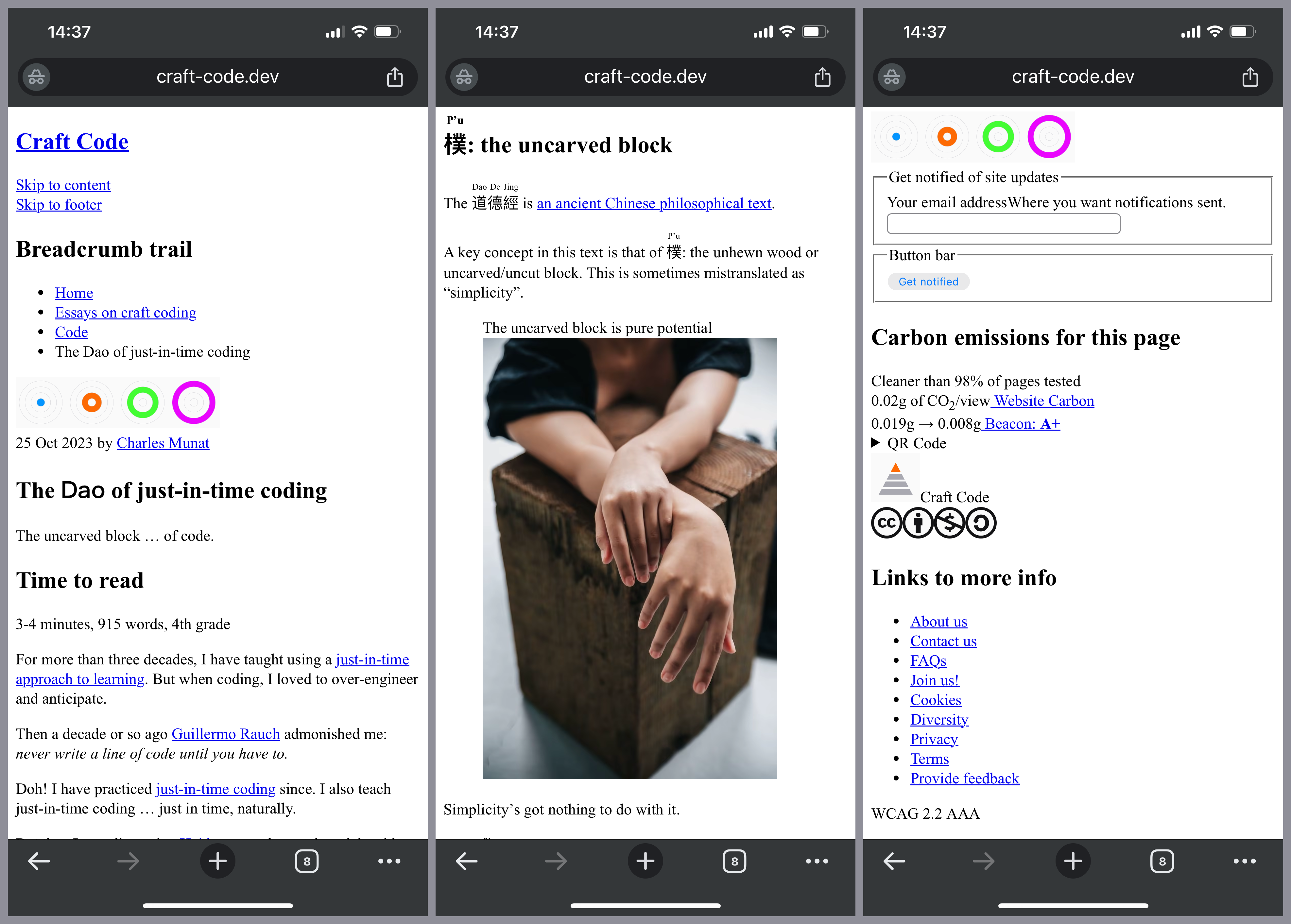
Unresponsive? Whereʼs a defibrillator when you need one?
Anyone who uses a smart phone to surf the internet encounters such sites daily. Unless like most people you hate the public sphere and spend all your time on Big Tech sites such as F**k or Instagram.
But here is a secret that many web developers have forgotten, if we ever knew it:
HTML is responsive by default.
What that means is this:
More often than not, we use CSS to destroy responsiveness
rather than to maintain or enhance it.
Itʼs not intentional, of course. Few realize that thatʼs what weʼre doing even as we do it. And this is because we start construction with the roof instead of the foundation.
First we use CSS to destroy responsiveness. Then we add a few media query hacks to try to get back some semblance of it. HTML is often an afterthought.
All we need are <div> and <span> elements,
right? Lots of ʼem.
It is like designing a car by building the skin first, then trying to force the engine, drivetrain, etc. to fit. You can do it that way, but it wonʼt be comfortable, safe, or maintainable.
Better to build it from the wheels up for performance and safety, and then to find an attractive body to fit over it. Why not do it right from the outset?
We can make our sites both responsive and attractive by following a simple approach. Donʼt code outside-in. Code inside-out.
Start with the foundation
Begin by creating your component, page, or even the whole site in semantic HTML. No CSS at all. No JavaScript.
Add the <!DOCTYPE>, the <html>
(donʼt forget the lang attribute), <head>, and <body>
elements. Then add the viewport and charset <meta> elements and a <title>
to the <head> element:
<!doctype html>
<html lang="en">
  <head>
    <meta charset="utf-8" />
    <meta
      content="width=device-width, initial-scale=1"
      name="viewport"
    />
    <title>Responsive by default</title>
  </head>
  <body></body>
</html>
This example shows our boilerplate HTML — the HTML with which we start every HTML page. At the top is the document type declaration that letʼs the browser know that this is HTML5 markup.
Then we have our html element with the lang
attribute set to en … because our page is in English.
Inside the html element we have the standard head and
body elements. The body element is currently
empty. This is where our page content goes.
The element contains three children so far. The first is a
meta
element with the charset attribute set to “utf-8”. Next, a meta
element with name “viewport” and content set to
“width=device-width, initial-scale=1”.
Finally, the head element contains a title
element with the content
“Responsive by default”.
Now youʼre ready to be responsive by default.
Build the body next. Start with the landmark elements. At the top level is <main>. Note how all the
virtual DOM libraries screw this up by putting a
<div> at the top. They donʼt care about correct
HTML. But coding by hand we can get it right.
Add the other landmark elements as needed: <header>
and <footer> and optionally a <nav> element. Nest these in <main> if you prefer.
Hundreds of articles and tutorials have explained how to nest heading elements. Itʼs easy! Yet more than half of all web sites still get it wrong. Why? Craft Coders get this right.
Moving on, you may want an <article> element with nested
<section> elements. And, of course, properly nested <h1> to <h6> elements. How about an
<aside>? Is there a <form>? Be
sure that your use of each is correct and standards compliant.
How do you know if youʼve done this right? Many HTML tools will allow you to see your page hierarchy. Here is the Craft Code home page. But possibly the quickest way is to use the HTML5 outliner extension. Here is what the HTML5 outline of the Craft Code home page looks like:

The best resource for HTML help that weʼve found is Mozilla Developer Network (MDN). Of course, the final arbiter is the HTML standard itself.
Work your way down through your page hierarchy. Use the correct semantic
element for the type of content. For example, an <address> element for a street address.
Parse through the text mentally and ask, What is this? And, Is there a way to make clear to the browser the type of this content with a semantic HTML element?
How many of these do you know? How many do you use regularly?
-
<p>for paragraphs,<a>for links,<button>for buttons. -
<details>and<summary>for text that might not be of interest. We can hide it but keep it available to the user. -
<ol>with<li>for ordered lists — lists in which the order of elements matters. -
<ul>with<li>for unordered lists — lists in which the order of elements doesnʼt matter. -
<dl>,<dt>, and<dd>with<dfn>(if a definition) for description lists or glossaries. -
<figure>with<figcaption>for figures. They are more common than you might think. Great way to caption images, charts, graphs, etc. -
<form>,<fieldset>,<legend>,<label>,<input>,<textarea>,<select>,<option>,<optgroup>,<datalist>, and<button>for forms. Do you know what all these do? Why not use them properly? -
<table>,<caption>,<thead>,<tbody>,<tfoot>,<colgroup>,<col>,<tr>,<th>,<td>for tabular data. And only for tabular data. You will rarely need a table. Avoid when possible. -
<picture>,<source>, and<img>for your images. Or<img>withsrcset. Donʼt forget thealtattribute. Consider wrapping these in<figure>. -
There are many other worthwhile flow elements, such as:
-
<code>for programming code. -
<pre>for pre-formatted text. -
<mark>for highlighted text. (Great with search results.) -
<ins>and<del>for insertions and deletions. -
<abbr>for abbreviations. Use thetitleattribute for the expansion of the abbreviation. -
<em>and<strong>for emphasis. -
<q>and<blockquote>for quotations. -
<cite>for citations. Have you ever used this one? You must have cited someone at some time. -
<sub>and<sup>for subscript and superscript letters (great for footnotes). -
<time>for dates and times. Again, ever used it? -
a few more obscure elements:
<kbd>for keyboard input.<samp>for sample output (from a computer program).<var>for mathematical variables.
-
Why is it that so many of us try to represent the semantics of these data with CSS alone? We can encode the semantics right into the HTML with ease and then add the visuals with CSS by tag name.
But most devs — letʼs be honest — who want to apply a style to a
time will add a <span> element and a
utility class. The <time> element? Never heard of it.
Or weʼll mark up a quotation by adding quotation marks
rather than using the <q> element. Donʼt we know
that the <q> element can add the quotation marks for us?
And that we can use CSS to choose the quote style?
body {
  quotes: "“" "”" "‘" "’";
}
This code example shows the quotes property set on the body element. The values are themselves enclosed in double quotation marks.
The first two are the outer quotation marks and the second two are the
inner quotation marks. In the example, the first two are the left and right
double curly quotation marks and the second two are the left and right
single curly quotation marks.
And how many of us have remembered to cite the source?
<q cite="https://craft-code.dev/essays/code/responsive-by-default">
  <abbr title="HyperText Markup Language">HTML</abbr>
  is responsive by default.
</q>
The example shows the correct use of the q element. We have
set the cite attribute to the URL of the reference. In this
case, the quotations is “HTML is responsive by default” and
the cite
attribute points to this page. We also use the abbr
element properly on the HTML abbreviation. Just for fun.
When we ignore the semantic aspects of HTML we squander all the potential benefits. Such as machine-readability, accessibility, sustainability. And, often, responsiveness.
And all for naught because semantic HTML doesnʼt prevent us from doing whatever we want with CSS. It helps us.
Wouldnʼt it be nice if we didnʼt turn around and use CSS to mess everything up?
An example page
What does this look like in practice? Well, here is a simplified example:
<!DOCTYPE html>
<html lang="en">
<head>
<meta charset="utf-8">
<meta name="viewport" content="width=device-width, initial-scale=1">
<meta
name="description"
content="This here page is responsive by default! Wee hoo!"
>
<title>Responsive by default</title>
</head>
<body>
<header role="banner">
<h2>I be responsive by default</h2>
<a href="#main">Skip to main content</a>
</header>
<nav
aria-labelledby="main-navigation-label"
role="navigation"
>
<h2 id="main-navigation-label">Main navigation</h1>
<ul role="presentation">
<li>
<a href="/about">About us</a>
</li>
<li>
<a href="/contact-us">Contact us</a>
</li>
<li>
<a href="/terms-of-use">Terms of use</a>
</li>
</ul>
</nav>
<main id="main-content" role="main">
<article>
<header>
<h1>Here be the main content</h1>
</header>
<!-- main content here -->
</article>
</main>
<footer role="contentinfo">
<p>© 2023 by Really Smart Devs.</p>
</footer>
</body>
</html>
This somewhat long example starts with the HTML boilerplate we
described above. It adds a meta element with name “description” and
content set to “This here page is responsive by
default! Wee hoo!” to to the head element.
We are silly. So sue us.
Then, in the body element we add four landmark elements: header,
nav, main, and footer.
Following recommended practice, we set the role
attributes redundantly to “banner”, “navigation”, “main”, and “contentinfo”, respectively.
The header element contains an h2 element and
a skip link to the main content.
The nav element contains an h2 element and an
unordered list (ul) element with four list items (li), each with an anchor (a) element. This is our page
menu.
The main element contains an article element
with a header element containing a single h1
element for the title of the article. The main element has the id
attribute set to “main-content” to provide the target for the
skip link.
The footer element contains only a paragraphg with copyright
info for the page.
But how does an actual page look? OK, Iʼve added one here. It is the essay on just-in-time coding, simplified a bit to make the html easier to follow.
Is it ugly as sin? You bet. But is it usable? Iʼd argue yes. More importantly, is it responsive? Well, here it is on my phone. Try it on yours.
We can also take a look at the page using the Lynx text-only browser. No CSS. No JS. No images. Nothing but text. So does it work? Take a look:

Performance
So. How does this score in Lighthouse?
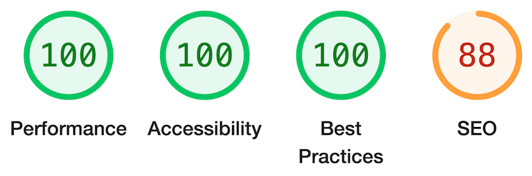
So thatʼs looking pretty g… whoa! What the heck is up with that 88?
Well, partly it is because we have added the
<meta content="noindex" name="robots"> element to the <head>. This prevents search engines from indexing the page. We donʼt want
users landing on this example page thinking that it is an actual site
page! But if we remove that, we still achieve only a 95%.
What gives?
This is actually a problem with the browser. Chromeʼs default stylesheet does not enforce a minimum “tap size” for links and buttons. The links in the unordered lists are too closely spaced (by browser default). Chrome oughta give more room for fat fingers. Like mine.
But users can zoom, we will fix it with CSS, and it is hard to imagine a
phone user without CSS. So weʼll leave it. (We could wrap the links
in <p>
elements to get that space, but thatʼs a hack, so weʼll avoid
it.)
There we have it. Responsiveness is not something we add to our web pages. It is something we destroy — if weʼre not careful and thoughtful as we code. Keep it responsive.
Next: progressive enhancement.